
How to Add a Footer Theme Toggle Button in Next.js Like the Official Site
Add a footer theme toggle in Next.js that works exactly like the official Next.js site, with light, dark, and system modes, no hydration issues, and a production-ready setup using next-themes and Tailwind CSS.


In this guide, we’ll build a footer theme toggle that behaves and looks exactly like the one used on the official Next.js website.
It supports:
- Light, Dark, and System themes
- System preference detection
- No hydration mismatch
- Proper active state UI
- Smooth UX identical to nextjs.org
This setup uses Next.js + Tailwind CSS + next-themes.
Prerequisites
You should already have:
- A working Next.js app (App Router)
- Tailwind CSS configured
next-themesinstalled and set up
If you haven’t added dark mode with next-themes yet, read one of these first 


If you want to skip the steps, you can directly clone the repository here
A Next.js boilerplate with preconfigured dark mode using next-themes, Tailwind CSS, and TypeScript. Includes a single-click theme toggle in the navbar and a footer theme switcher styled like the of…

Or Check the live demo here
A Next.js boilerplate with preconfigured dark mode using next-themes, featuring a one-click theme toggle in the navbar and a footer theme switcher styled and behaving like the official Next.js site. Created by Sujal Vanjare.

Step 1: Create the footer theme toggle component
Create a new file: src/ui/theme-toggle-footer.tsx or .jsx
"use client";

import { JSX } from "react";

export default function ThemeToggleFooter(): JSX.Element {
  return <div></div>;
}This component will contain three buttons:
- Light (Sun icon)
- System (Monitor icon)
- Dark (Moon icon)
The icons and UI are taken directly from the Next.js footer toggle, and the styles are recreated using Tailwind CSS.
Step 2: Theme state and hydration handling
We start by reading the theme and handling hydration correctly.
"use client";

import { useTheme } from "next-themes";
import { JSX, useEffect, useState } from "react";

export default function ThemeToggleFooter(): JSX.Element {
  const { theme, setTheme } = useTheme();
  const [mounted, setMounted] = useState(false);

  useEffect(() => {
    setMounted(true);
  }, []);

  const isActive = (value: string) => mounted && theme === value;

  return <div></div>;
}Why this matters
mountedensures the component renders only on the client- Prevents hydration mismatch
- Disables pointer events before hydration
- Matches how Next.js handles theme toggling internally
isActive is used to visually highlight the currently selected theme.
Add cn utility function (required for the theme toggle)
Inside the src folder, create a utils folder.
Inside the utils folder, create a class-merge.ts file.
This utility is required for the theme toggle to merge Tailwind classes correctly.
First, install the required dependencies:
Using pnpm:
pnpm i clsx tailwind-mergeUsing npm:
npm install clsx tailwind-mergeNow, copy and paste the code below into src/utils/class-merge.ts
import { ClassValue, clsx } from "clsx";
import { twMerge } from "tailwind-merge";

export default function cn(...inputs: ClassValue[]): string | undefined {
  const classNames = twMerge(clsx(...inputs));
  return classNames || undefined; // Return undefined when classNames is empty to avoid rendering the class attribute.
}Step 3: Footer theme toggle UI (Next.js-style)
Below is the complete toggle UI with exact spacing, borders, colors, and hover states.
You don’t need to change anything - just paste it in theme-toggle-footer.tsx
"use client";

import cn from "@/utils/class-merge";
import { useTheme } from "next-themes";
import { JSX, useEffect, useState } from "react";

export default function ThemeToggleFooter(): JSX.Element {
  const { theme, setTheme } = useTheme();
  const [mounted, setMounted] = useState(false);

  useEffect(() => {
    setMounted(true);
  }, []);

  const isActive = (value: string) => mounted && theme === value;

  return (
    <div
      aria-label="Theme selector"
      className="flex w-fit p-0.75 rounded-full border border-solid border-[hsla(0,0%,92%,1)] dark:border-[hsla(0,0%,18%,1)]"
    >
      {/* light Button */}
      <button
        type="button"
        disabled={!mounted}
        aria-pressed={isActive("light")}
        onClick={() => mounted && setTheme("light")}
        className={cn(
          "cursor-pointer rounded-[inherit] w-8 h-8 flex justify-center items-center transition-colors",
          mounted ? "cursor-pointer" : "cursor-default pointer-events-none",
          isActive("light")
            ? "bg-[hsla(0,0%,90%,1)] dark:bg-[hsla(0,0%,16%,1)] text-[#111] dark:text-[#fafafa]"
            : "text-[hsla(0,0%,40%,1)] dark:text-[hsla(0,0%,63%,1)] hover:text-[#111] dark:hover:text-[#fafafa]",
        )}
      >
        {/* Sun Icon */}
        <svg viewBox="0 0 16 16" width="16" height="16">
          <g clipPath="url(#clip0_53_17725)">
            <path
              fill="currentColor"
              fillRule="evenodd"
              d="M8.75.75V0h-1.5v2h1.5V.75M3.26 4.32l-.53-.53-.35-.35-.53-.53L2.9 1.85l.53.53.35.35.53.53zm8.42-1.06.53-.53.35-.35.53-.53 1.06 1.06-.53.53-.35.35-.53.53zM8 11.25a3.25 3.25 0 1 0 0-6.5 3.25 3.25 0 0 0 0 6.5m0 1.5a4.75 4.75 0 1 0 0-9.5 4.75 4.75 0 0 0 0 9.5m6-5.5h2v1.5h-2zm-13.25 0H0v1.5h2v-1.5H.75m1.62 5.32-.53.53 1.06 1.06.53-.53.35-.35.53-.53-1.06-1.06-.53.53zm10.2 1.06.53.53 1.06-1.06-.53-.53-.35-.35-.53-.53-1.06 1.06.53.53zM8.75 14v2h-1.5v-2z"
              clipRule="evenodd"
            ></path>
          </g>
          <defs>
            <clipPath id="clip0_53_17725">
              <rect width="16" height="16" fill="white"></rect>
            </clipPath>
          </defs>
        </svg>
      </button>

      {/* System */}
      <button
        type="button"
        disabled={!mounted}
        aria-pressed={isActive("system")}
        onClick={() => mounted && setTheme("system")}
        className={cn(
          "cursor-pointer rounded-[inherit] w-8 h-8 flex justify-center items-center transition-colors",
          mounted ? "cursor-pointer" : "cursor-default pointer-events-none",
          isActive("system")
            ? "bg-[hsla(0,0%,90%,1)] dark:bg-[hsla(0,0%,16%,1)] text-[#111] dark:text-[#fafafa]"
            : "text-[hsla(0,0%,40%,1)] dark:text-[hsla(0,0%,63%,1)] hover:text-[#111] dark:hover:text-[#fafafa]",
        )}
      >
        {/* System Icon */}
        <svg viewBox="0 0 16 16" width="16" height="16">
          <path
            fill="currentColor"
            fillRule="evenodd"
            d="M0 2a1 1 0 0 1 1-1h14a1 1 0 0 1 1 1v8.5a1 1 0 0 1-1 1H8.75v3h1.75V16h-5v-1.5h1.75v-3H1a1 1 0 0 1-1-1zm1.5.5V10h13V2.5z"
            clipRule="evenodd"
          ></path>
        </svg>
      </button>

      {/* Dark */}
      <button
        type="button"
        disabled={!mounted}
        aria-pressed={isActive("dark")}
        onClick={() => mounted && setTheme("dark")}
        className={cn(
          "cursor-pointer rounded-[inherit] w-8 h-8 flex justify-center items-center transition-colors",
          mounted ? "cursor-pointer" : "cursor-default pointer-events-none",
          isActive("dark")
            ? "bg-[hsla(0,0%,90%,1)] dark:bg-[hsla(0,0%,16%,1)] text-[#111] dark:text-[#fafafa]"
            : "text-[hsla(0,0%,40%,1)] dark:text-[hsla(0,0%,63%,1)] hover:text-[#111] dark:hover:text-[#fafafa]",
        )}
      >
        {/* Moon Icon */}
        <svg viewBox="0 0 16 16" width="16" height="16">
          <path
            fill="currentColor"
            fillRule="evenodd"
            d="M1.5 8a6 6 0 0 1 3.62-5.51 7 7 0 0 0 7.08 9.25A5.99 5.99 0 0 1 1.5 8M6.42.58a7.5 7.5 0 1 0 7.96 10.41l-.92-1.01a5.5 5.5 0 0 1-6.3-8.25zm6.83.42v1.75H15v1.5h-1.75V6h-1.5V4.25H10v-1.5h1.75V1z"
            clipRule="evenodd"
          ></path>
        </svg>
      </button>
    </div>
  );
}If you’re using JavaScript (.jsx)
The code above is written in TypeScript.
If you’re using JavaScript (.jsx), remove the type annotations and use this instead:
export default function ThemeToggleFooter() {
  const { theme, setTheme } = useTheme();
  const [mounted, setMounted] = useState(false);

  useEffect(() => {
    setMounted(true);
  }, []);

const isActive = (value) => mounted && theme === value;Everything else remains the same.
Step 4: Add the toggle to your footer
If you already have a footer, just import and render:
<ThemeToggleFooter />If you don’t have a footer, use this one (styled to match Next.js):
import Image from "next/image";
import ThemeToggleFooter from "./theme-toggle-footer";

export default function Footer() {
  return (
    <footer className="bg-white dark:bg-black text-black dark:text-zinc-50 w-full border-t border-t-solid border-t-black/8 dark:border-t-white/14">
      <div className="flex flex-col gap-4 max-w-3xl mx-auto px-16 py-10 justify-between items-center md:flex-row">
        <div className="flex flex-col gap-4 text-base font-medium md:flex-row">
          <a
            target="_blank"
            rel="noopener noreferrer"
            href="https://vercel.com/new"
            className="flex h-12 w-full items-center justify-center gap-2 rounded-full bg-[#171717] dark:bg-[#ededed] px-5 text-white dark:text-[#0a0a0a] transition-colors hover:bg-[#383838] dark:hover:bg-[#ccc] md:w-39.5"
          >
            <Image
              src="/vercel.svg"
              alt="Vercel logomark"
              width={16}
              height={16}
              className="dark:invert w-5 h-5 mb-0.5"
            />
            Deploy Now
          </a>
          <a
            className="flex h-12 w-full items-center justify-center rounded-full border border-solid border-black/8 px-5 transition-colors hover:border-transparent hover:bg-black/4 dark:border-white/[.145] dark:hover:bg-[#1a1a1a] md:w-39.5"
            href="https://nextjs.org/docs"
            target="_blank"
            rel="noopener noreferrer"
          >
            Documentation
          </a>
        </div>

        <div className="flex flex-col gap-5.5 items-center md:items-end">
          <a
            target="_blank"
            rel="noopener noreferrer"
            href="https://www.sujalvanjare.com/blog/how-to-add-dark-mode-in-nextjs-16-with-tailwind-css-v4-typescript"
            className="cursor-pointer inline-flex items-center gap-0.5 text-[.875rem] leading-5 text-[hsla(0,0%,40%,1)] dark:text-[hsla(0,0%,63%,1)] hover:text-black dark:hover:text-white [transition:color_.1s]"
          >
            Blog: How to add Dark mode in Next.js
            <svg
              strokeLinejoin="round"
              viewBox="0 0 16 16"
              width="16"
              height="16"
            >
              <path
                fillRule="evenodd"
                clipRule="evenodd"
                d="M11.5 9.75V11.25C11.5 11.3881 11.3881 11.5 11.25 11.5H4.75C4.61193 11.5 4.5 11.3881 4.5 11.25L4.5 4.75C4.5 4.61193 4.61193 4.5 4.75 4.5H6.25H7V3H6.25H4.75C3.7835 3 3 3.7835 3 4.75V11.25C3 12.2165 3.7835 13 4.75 13H11.25C12.2165 13 13 12.2165 13 11.25V9.75V9H11.5V9.75ZM8.5 3H9.25H12.2495C12.6637 3 12.9995 3.33579 12.9995 3.75V6.75V7.5H11.4995V6.75V5.56066L8.53033 8.52978L8 9.06011L6.93934 7.99945L7.46967 7.46912L10.4388 4.5H9.25H8.5V3Z"
                fill="currentColor"
              ></path>
            </svg>
          </a>

          <a
            target="_blank"
            rel="noopener noreferrer"
            href="https://github.com/Sujal-Vanjare/next.js-dark-mode-toggle-boilerplate-tailwind-css-typscript"
            className="cursor-pointer inline-flex items-center gap-0.5 text-[.875rem] leading-5 text-[hsla(0,0%,40%,1)] dark:text-[hsla(0,0%,63%,1)] hover:text-black dark:hover:text-white [transition:color_.1s]"
          >
            Source code
            <svg
              strokeLinejoin="round"
              viewBox="0 0 16 16"
              width="16"
              height="16"
            >
              <path
                fillRule="evenodd"
                clipRule="evenodd"
                d="M11.5 9.75V11.25C11.5 11.3881 11.3881 11.5 11.25 11.5H4.75C4.61193 11.5 4.5 11.3881 4.5 11.25L4.5 4.75C4.5 4.61193 4.61193 4.5 4.75 4.5H6.25H7V3H6.25H4.75C3.7835 3 3 3.7835 3 4.75V11.25C3 12.2165 3.7835 13 4.75 13H11.25C12.2165 13 13 12.2165 13 11.25V9.75V9H11.5V9.75ZM8.5 3H9.25H12.2495C12.6637 3 12.9995 3.33579 12.9995 3.75V6.75V7.5H11.4995V6.75V5.56066L8.53033 8.52978L8 9.06011L6.93934 7.99945L7.46967 7.46912L10.4388 4.5H9.25H8.5V3Z"
                fill="currentColor"
              ></path>
            </svg>
          </a>

          <ThemeToggleFooter />
        </div>
      </div>
    </footer>
  );
}Step 5: Add footer to layout.tsx
Make sure your root layout is wrapped with ThemeProvider.
import { ThemeProvider } from "next-themes";
import Footer from "@/ui/footer";

export default function RootLayout({ children }: { children: React.ReactNode }) {
  return (
    <html lang="en" suppressHydrationWarning>
      <body>
        <ThemeProvider
          attribute="class"
          defaultTheme="system"
          enableSystem
          disableTransitionOnChange
        >
          {children}
          <Footer />
        </ThemeProvider>
      </body>
    </html>
  );
}If you’re using JavaScript (.jsx)
The code above is written in TypeScript.
If you’re using JavaScript (.jsx), remove the type annotations and use this instead:
export default function RootLayout({ children }) {
return (Everything else remains the same.
Final Result 
You now have a footer theme toggle that works exactly like the official Next.js site, including:
- Light / Dark / System modes
- System preference sync
- No hydration issues
- Correct disabled state before mount
- Pixel-accurate UI behavior
This is the same UX pattern used on nextjs.org, adapted cleanly for your own project.
Done! 
Creating detailed tutorials like this takes a lot of time, and I don’t run any Google ads on my blog so you can follow along easily without distractions.
If this guide helped you and you’d like to support my work and future tutorials, please consider:
or
Buy my premium Next.js website template, which lets you use Notion as a CMS, for your portfolio and blogs.
My own site is fully built and running on this same template.
Buy Now 


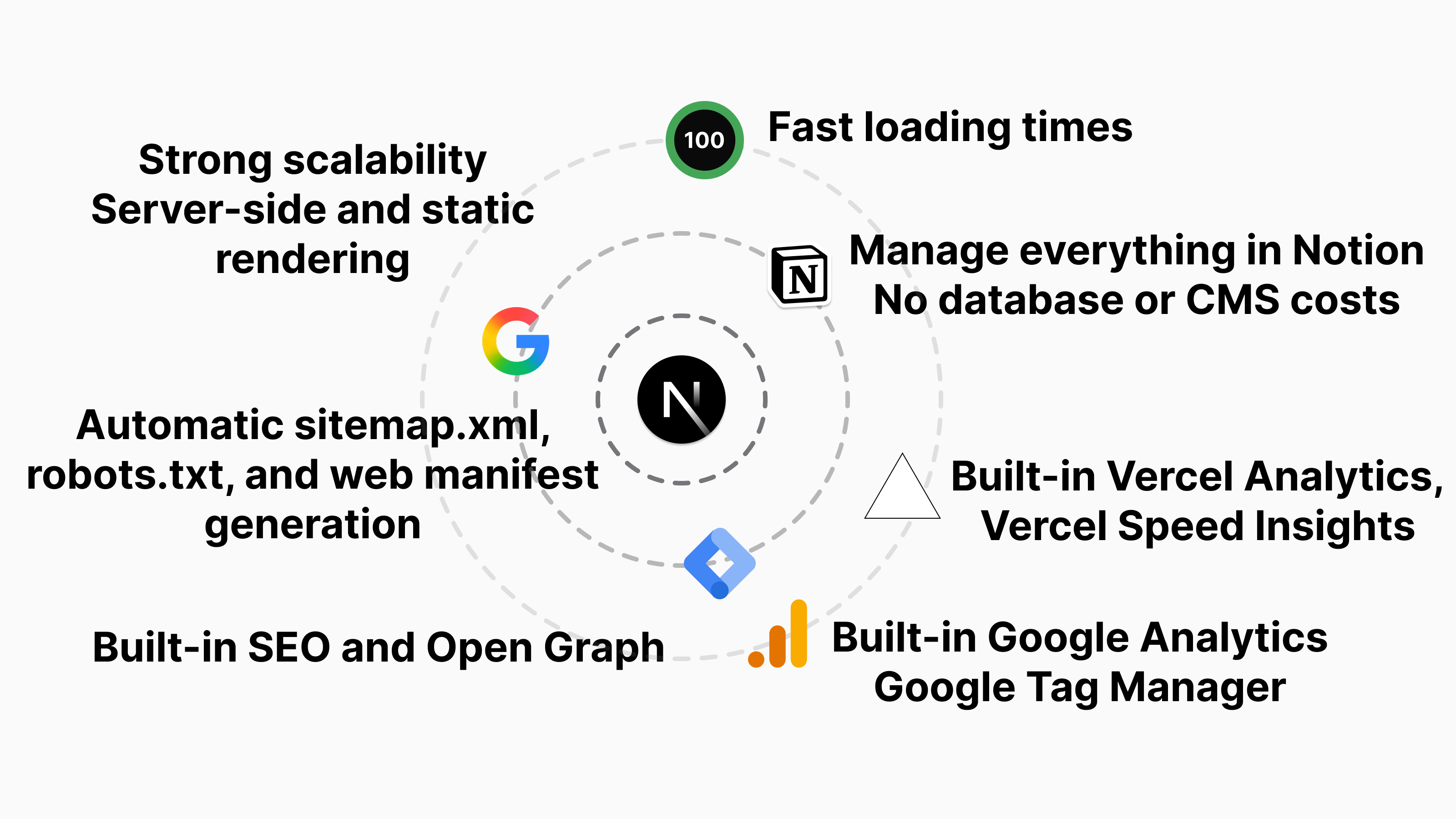


Portfolio/blog template where Notion is used as a headless CMS, enabling full control of your website, content, routes/slugs, SEO, Open Graphs, header/footer links, social links, favicon, manifest, robots.txt, and sitemap.xml.
Every bit of support helps me create more high-quality tutorials just like this. Thank You  for your support.